The importance of a font
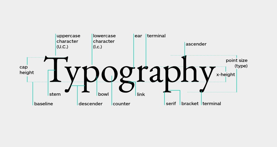
There is a lot of science behind a font… all of the different elements of the wording, the thickness of certain parts of the letters, the distance between the letters, the legibility, the height of the upper case letter compared to the height of the lower case letter…

When we read, our eyes follow a natural pattern called a Scan Path.
We break sentences up into scans (saccades) and pauses (fixations). Here’s the Scan Path for a typical reader:

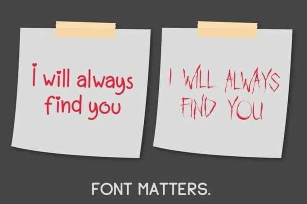
Chosing the right font has a big impact on your design and the message you’re trying to get across- take a look at this example….

Tips on finding a good font
1. Choose an anchor font
Selecting a typeface for the content that is most prevalent in your project (most likely your body copy).
This will be the typeface that you base your other font decisions on like headlines and subheads.
For reading on the Web, it’s best to stay away from script, calligraphy or decorative typefaces. Decorative fonts can be hard to read, this will slow the reader down and if they’re struggling to determine if the letter is an ‘a’ or an ‘e’ (for example) they are likely to get sick of reading and you can lose them.
Decorative typefaces should be used for content that is meant to be seen at a glance, like in a logo, rather than read as multiple paragraphs in body text.
2. Pick a font size bigger than 12pt
As more reading shifts to digital and screen resolutions improve, the way we read content is changing. Many designers mention that 16pt font is the new 12pt font. A recent study has also shown that larger font sizes can elicit a stronger emotional connection.
While having a huge font over 30pt most likely wouldn’t make sense, many blogs have font in the 10pt-12pt range. Try increasing your font size. If you’re using 12pt font, try increasing to 16pt font. If you’re using 18pt font increase to 22pt.
3. Watch your line length
The line length is how far your sentences stretch across the page. The ideal line length should be between about 50 to 75 characters.
Here’s an example of the longest line length from Zen Habits. It’s 78 characters, about 6.5 inches:
This line length has been shown to be most effective in helping readers move through their Scan Path.
If the line length is too short, your reader’s rhythm will break because their eyes must travel back to the left of the page too often.
A line length that is too long makes it hard to find where lines of text start and end. It can make it difficult for your reader to get to the next line without accidentally jumping to the wrong place.
Research shows that your subconscious mind gets a boost of energy when jumping to a new line (as long as it doesn’t happen too often) but this energy dwindles as you read over the duration of the line.
4. Mind your spacing
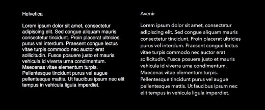
Adequate spacing between letters is important for your readers to be able to move through sentences fluidly. The tighter your letters are together, the harder it is for people to identify the shapes that make up different letterforms.
Take a look at another example from Jessica Hische of the readability of Helvetica versus Avenir. Hische recommends Avenir because of its more open spacing:

Watch out for our video on finding and downloading fonts… for FREE!

